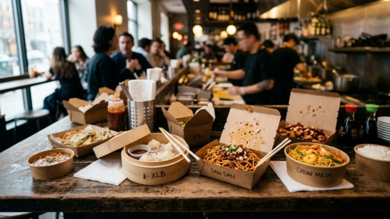
You’ve perfected your recipes. Your dining room is full on Friday nights. But at the end of the month, the numbers don’t add up. If that sounds familiar, the problem might not be in your kitchen — it might be sitting on every table, right in front of your customers. Your menu is either working for you or against you, and most restaurant owners never find out which until they take a hard look at the data.
Menu engineering is the systematic practice of analyzing what you sell, how often you sell it, and how much money each dish actually makes — then redesigning your menu to guide customers toward the items that are most profitable. Done right, it can increase overall profits by 10–15% without raising prices across the board. In our conversations with restaurant owners across New York, we’ve found that most haven’t reviewed their menu through this lens — ever.
Key Takeaways
- Menu engineering combines sales data and design psychology to maximize profitability.
- Every item on your menu fits into one of four categories: Stars, Plowhorses, Puzzles, or Dogs — and each requires a different strategy.
- Layout, visual cues, and pricing format can all influence what customers order, often without them realizing it.
- Restaurants that regularly review and re-engineer their menus outperform those that don’t.
What Is Menu Engineering (And Why Should You Care)?
Menu engineering is the process of evaluating every item on your menu based on two things: how often it sells (popularity) and how much profit it generates (contribution margin). The concept was formalized in the 1980s by restaurant consultants Donald Smith and Michael Kasavana, and it remains one of the most effective tools available to independent restaurant operators today.
According to NetSuite, the core goal of menu engineering is to improve a restaurant’s profit margins by making strategic decisions about which items to feature, how to price them, and where to place them on the page. It goes far beyond aesthetics — it’s about using real numbers to make smarter decisions.
Contribution margin — the amount of revenue left after subtracting food cost — is the most important metric in this process. As Meez explains, contribution margin tells you the exact dollar amount each sale contributes to your bottom line, which is more actionable than food cost percentage alone. A dish that sells 350 times a month at an $11 contribution margin generates more total profit than one that sells 120 times at $19 — a counterintuitive finding that menu engineering makes visible.
The Four Quadrants: Stars, Plowhorses, Puzzles, and Dogs
Once you’ve calculated the contribution margin and sales volume for each item, you place them on a matrix. Every dish falls into one of four categories:
| Category | Popularity | Profitability | What to Do |
|---|---|---|---|
| ⭐ Stars | High | High | Protect and promote — feature prominently, consider modest price increase |
| 🐴 Plowhorses | High | Low | Adjust portion, swap ingredients, or slightly raise price to improve margin |
| 🧩 Puzzles | Low | High | Reposition on the menu, promote as specials, improve descriptions |
| 🐕 Dogs | Low | Low | Remove or replace — they drain kitchen resources without returning value |
Your Stars are the foundation of your menu — they should be featured prominently and protected from unnecessary change. Baker Tilly, a restaurant consulting firm, notes that Puzzles are high-profit items that simply lack visibility, and that better descriptions or strategic placement can unlock their revenue potential. Dogs, meanwhile, are costing you kitchen complexity, prep time, and inventory without meaningful return.
How to Calculate Contribution Margin
The math is simple: take the selling price of a dish and subtract its food cost (the actual ingredient cost per serving). If a plate of mapo tofu sells for $18 and costs $5.40 in ingredients, the contribution margin is $12.60. Do this for every item, rank them from highest to lowest, then cross-reference with your sales volume data from your POS to determine each item’s quadrant.
A standard food cost percentage for most restaurants falls between 28–32% of the menu price, according to industry benchmarks. Items significantly above that threshold warrant either a price adjustment or an ingredient substitution.
The Psychology of Menu Layout
Once you’ve categorized your items, the next step is understanding how customers actually read a menu — because it’s not how you might expect.
The Golden Triangle
Eye-tracking research shows that when a customer opens a menu, their gaze doesn’t start at the top left the way they’d read a book. Instead, they typically look first at the center of the page, then move to the top right, then to the top left — a pattern often called the “golden triangle.” These three zones are prime real estate. Place your most profitable Stars and highest-margin Puzzles here, and you’ll nudge ordering decisions in your favor without the customer ever realizing it.
For single-page menus, customers scan in a Z-pattern: top left across to top right, then diagonally down to bottom left and across to bottom right. In either layout, the bottom of the menu receives the least attention — so avoid burying your moneymakers there.
Using Visual Cues to Direct Attention
Boxes, borders, icons, and bold typography all interrupt the natural scanning pattern and direct the eye where you want it. ChowNow notes that strategic visual emphasis can increase orders on highlighted items, but cautions that the effect disappears if you highlight too many dishes at once — if everything is special, nothing is. Limit visual callouts to two or three items per menu section at most.
A well-placed “Chef’s Recommendation” badge or a simple shaded box around a high-margin item gives indecisive customers an easy shortcut. Many customers default to whatever looks endorsed, which works in your favor when the endorsed item is also your most profitable one.
The Dollar Sign Problem
This is one of the most evidence-backed findings in menu psychology: removing the dollar sign from prices leads customers to spend more. A Cornell University study found that diners spent about 8% more when menus displayed prices as numerals without a dollar sign, compared to menus with the “$” symbol present. The reason, researchers concluded, is that the dollar sign activates the “pain of paying” in a customer’s brain — a psychological friction that encourages restraint. Remove it, and that friction is softened.
Practical implication: list prices as clean numbers (“18” instead of “$18.00”), align them flush right after the description rather than in a separate right-hand column, and drop the decimals. A right-aligned column of prices invites customers to scan the column from cheapest to most expensive — the last thing you want.
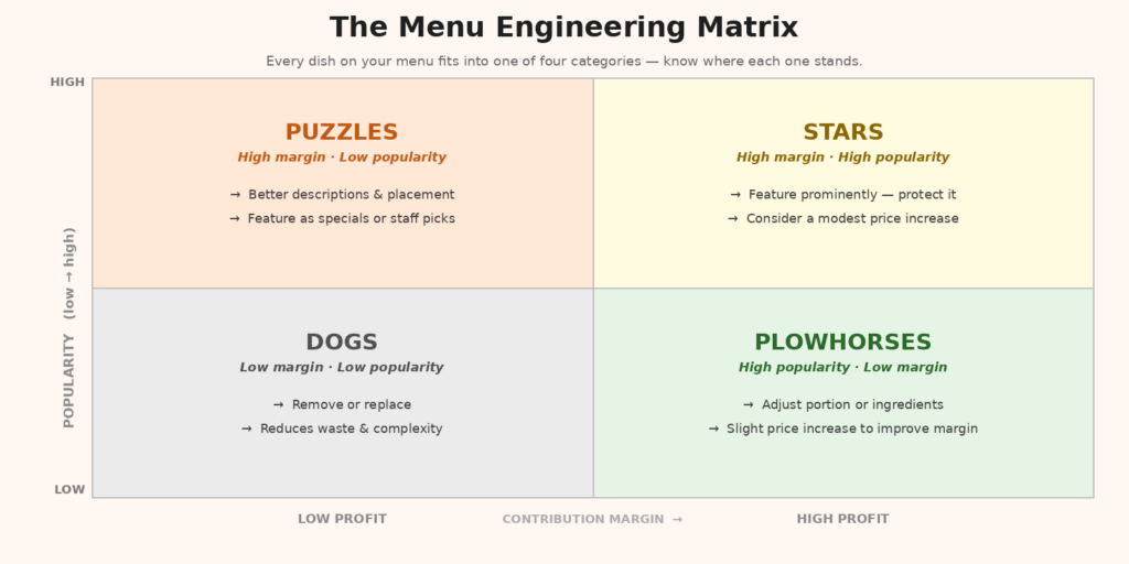
The menu engineering matrix helps you categorize every dish and decide how to act on it.
Strategic Pricing: Anchors and Decoys
Anchor pricing is another tool worth understanding. When you place a high-priced item at the top of a menu section, it makes everything below it seem more reasonably priced by comparison. A $58 Peking duck placed at the top of your entrée section makes the $32 braised short rib look like excellent value — and the $32 item may well be your highest-margin dish.
This isn’t manipulation; it’s context. Customers don’t evaluate prices in a vacuum — they evaluate them relative to other options nearby. Smart menu design creates that context intentionally. Research cited by Supy found that strategic item placement can increase orders on targeted dishes by up to 15%, demonstrating how powerful positioning alone can be.
How Many Items Is Too Many?
More options feel generous, but they often hurt sales. Psychologist Barry Schwartz’s “paradox of choice” describes how excessive options lead to decision fatigue and reduced satisfaction. In a restaurant context, menu experts generally recommend no more than seven options per category before customers start feeling overwhelmed. Past that threshold, guests often default to safe, familiar choices — which may not be your highest-margin items.
TGI Fridays reduced their menu from over 90 items to around 60 in the early 2000s, focusing on high-performing Stars. The result was improved profitability and a more navigable experience for guests. A Canadian restaurant called Westside took a similar approach and saw average margin per customer increase by over 10% after streamlining a 181-item menu.
Putting It Together: A Menu Engineering Action Plan
Menu engineering doesn’t require a consultant or a redesign budget. Here’s a practical sequence any restaurant owner can follow:
- Pull your sales data. Choose a two-to-four week window from your POS and count how many times each item was ordered.
- Calculate contribution margin. For each item, subtract your food cost from the selling price.
- Build the matrix. Plot every item on a grid with sales volume on one axis and contribution margin on the other. Identify your Stars, Plowhorses, Puzzles, and Dogs.
- Redesign placement. Move Stars and Puzzles into the golden triangle. Use visual callouts for one or two priority items per section.
- Tighten the menu. Remove Dogs. Consolidate sections with more than seven items.
- Revise pricing format. Drop dollar signs and decimal points. Reformat price presentation to reduce price sensitivity.
- Review quarterly. Ingredient costs change. Customer preferences shift. Menu engineering should be an ongoing process, not a one-time project.
Don’t Forget Your Phone Orders
Menu engineering applies equally to your phone orders — arguably more so. When customers call in to order, they’re describing dishes from memory or from your physical menu. If your staff have to take the order manually, there’s a lag, a risk of error, and a missed opportunity to upsell. Tunvo’s AI voice agent answers every call, captures the full order in natural conversation, and sends it directly to your POS — meaning your engineered menu works just as hard for phone orders as it does in the dining room. If phone orders are a meaningful part of your business, visit Tunvo’s homepage to see how that works.
Frequently Asked Questions
How often should I do menu engineering?
At minimum, quarterly. Ingredient costs fluctuate, and what was a high-margin Star last season may become a Plowhorse after a supplier price increase. Many operators do a deeper review twice a year and a quick spot check monthly.
Should I use photos on my menu?
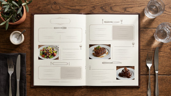
For physical in-restaurant menus, use photos sparingly — one or two for signature dishes at most. Too many images clutter the page and can cheapen the feel. For online ordering menus and delivery platforms, the calculus is different: photos significantly increase conversion rates, so every item should have one if possible.
Is menu engineering only for big restaurants?
No — in fact, smaller restaurants with tighter margins benefit the most. If you’re running a family-owned Chinese restaurant with 40–60 menu items, even a 5% shift in customer ordering patterns toward your highest-margin dishes can have a meaningful impact on monthly revenue.
What if I don’t have POS data?
Manual tally sheets work fine. For two to four weeks, have staff mark down every item sold at the end of each service. It’s not as precise as POS data, but it’s enough to identify your Stars and Dogs and take action.
Every missed phone order is a missed revenue opportunity. Tunvo’s AI voice agent answers every call, handles complex orders in English and Mandarin, and sends them straight to your MenuSifu POS. Start your 15-day free trial or book a demo — setup takes about 30 minutes.